More Data Isn't Better. Better Is Better.
Data should drive actions, not create more confusion.
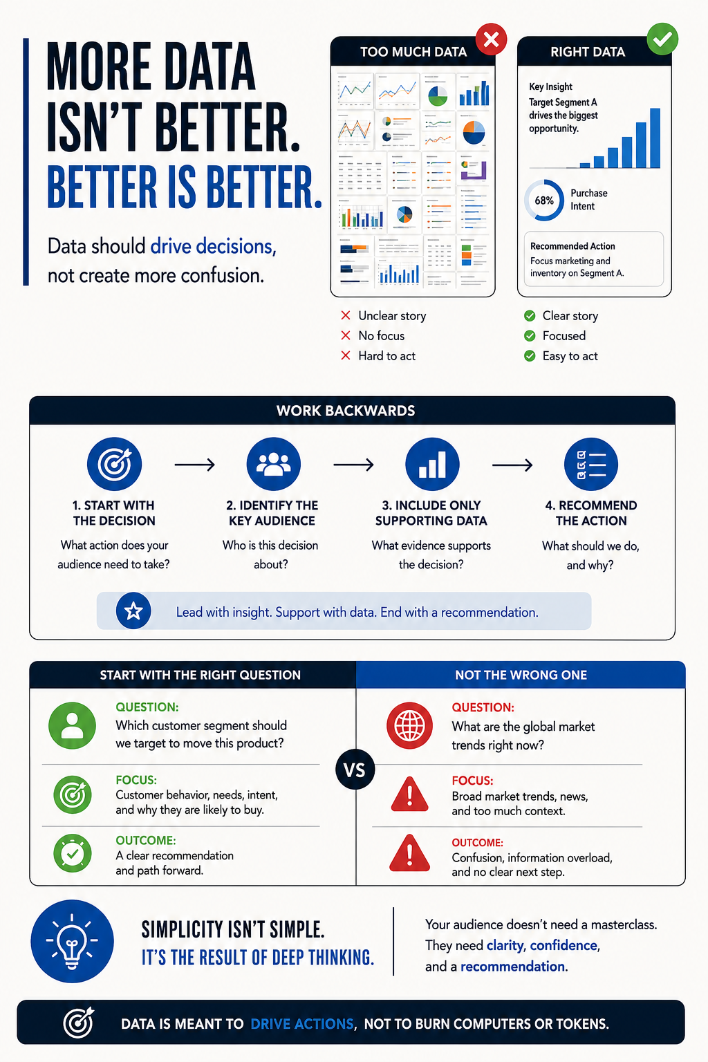
Something we always hear is: we want more data, we want more details, we want more information. And that's all great until it's too much, you don't know where it came from, you don't see how it connects to the bigger story, and you end up with a bloated dashboard that gives your audience nothing to act on.
When you're tasked with explaining something, it's easy to fall into the trap of showing how much you know. You want to prove how much work you did, how much analysis you ran, and how many numbers you found. But that's usually not the point, especially the higher up the information is going.
Start from the action, not from the analysis
If you're preparing a dashboard, a slide, or an email, think backwards.
Don't start from your analysis. Start from what action the person reading needs to take. Then ask yourself how you can support that recommendation with the right data.
That's where clarity starts. Not with more charts. Not with a bigger appendix. Not with a longer meeting.
Ask the right question
If the issue at hand is a product that isn't moving, and there's a clear kind of customer that might be more inclined to buy it, start there.
Don't spend half an hour talking about market trends and global news if that's not what will change the decision.
Start with the real question: which customer should we target to move this product?
Then support that with the data that actually matters:
- What trends are showing up in that customer segment
- How that customer behaves
- What that customer needs
- Why your recommendation gives the clearest path forward
Then, if needed, you can explain how you got there. Your audience probably already knows the background. What they want is a solution, not a master class.
Don't hide weak thinking behind complexity
Don't overpopulate dashboards. Don't overcomplicate processes. Don't use big words, jargon, or convoluted explanations just to make yourself look smart.
In my experience, talking in simple terms, getting to the point, and giving people time to ask questions is a much better way to build trust, get your message across, and move decisions forward.
When things are overcomplicated, people don't feel impressed. They feel confused. And when they're confused, they turn to someone else to give them an easier path forward.
Simplicity takes work
Simple does not mean shallow. Usually it's the opposite.
Simplicity is what happens when you've done enough thinking to remove what doesn't matter, keep what does, and make the recommendation obvious.
That's the job. Not to burn computers. Not to burn tokens. Not to dump everything you found onto a screen and hope your audience sorts it out.
Bottom line
Data is meant to drive actions, not to burn computers or tokens.
FAQ
What makes a dashboard useful?
A useful dashboard helps someone make a decision. It doesn't just display everything that exists.
What should come first, data or recommendation?
Start from the decision and the recommendation. Then include the data that supports it.
Why do overbuilt dashboards fail?
Because they create information overload, blur the story, and make it harder for the audience to know what to do next.